Mapping Geographical Variation in Implicit Racial Attitudes
By Jordan Axt
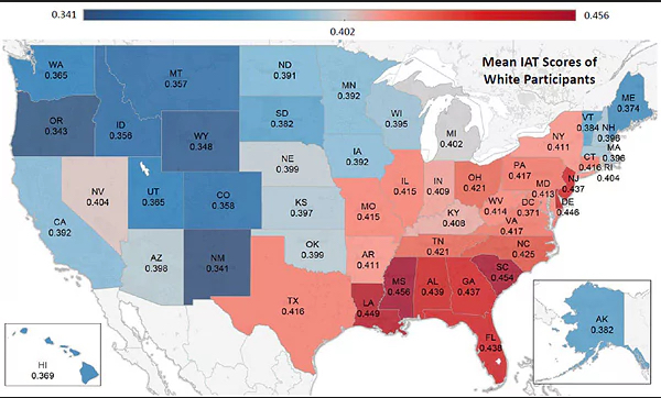
How do countries or states vary in their implicit racial attitudes? More than 10 years of data collection on Project Implicit (freely available here) provides a healthy amount of participants from across the world, particularly for the site’s most popular test, which assesses implicit race attitudes.
For example, Chris Mooney, writing for the Washington Post’s Wonkblog, created this map of state-by-state variation in implicit racial attitudes.
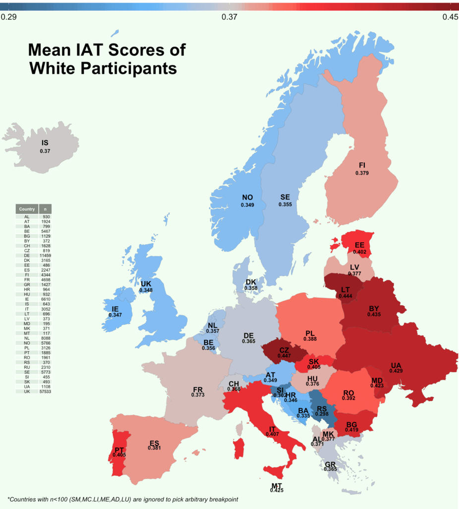
Second, the data underlying these graphs do not come from a “representative sample” of people from each area. That Project Implicit participants are volunteers who are perhaps already interested in the notion of implicit bias and almost certainly skews the sample in some ways (for example, PI participants tend to be more politically liberal and educated than other people living in the same area). Results might look different if these were truly random samples of each area. Moreover, this “sampling bias” may be more or less strong in certain states or countries. For instance, perhaps states or countries where Project Implicit has received more media coverage have a more diverse sample than states or countries where Project Implicit is less well-known.
Finally, these figures represent crude averages of very large areas. There is sure to be meaningful variation within any state or country as well (fortunately, the available datasets also list metropolitan areas for US participants, allowing for a more fine-grained map to be made in the future).
Even with those caveats, these maps lead to some interesting questions about what factors may be responsible for geographical variations in implicit attitudes. Our next post will dive into one possible influence on differences in area’s average levels of implicit racial attitudes.